New logo input

Status
Not open for further replies.

rainmax

Well-Known Member
Founding Member
Joined
Jan 5, 2013
Messages
985
Points
43
Location
Ljubljana, Slovenia
It has the story. From green leaf to yellow than fermented.
I thought like this but not in my domain. He was just asking for colors.

greenyellored.jpg

Also it can mean Oriental, Bright, cigar leaf. I believe those are nice colors or some variations on those.
 

Matty

Well-Known Member
Joined
Apr 1, 2012
Messages
700
Points
28
Location
Sherbrooke, Quebec
I'm a bit late I think but.... the first, first pic reminds me of either a maple leaf or, ummm, pot. Why not turn it upside down like a hand of tobacco? All the suggested colors are nice, but, if it is for the WLT store, maybe the progression of green to yellow to brown is unnecessary? Perhaps a cigar and or pipe included would be nice? I like the FTT logo. Maybe the WLT logo could incorporate the same look? Just my thoughts, please don't hurt me! Lol.
 

Brown Thumb

Well-Known Member
Joined
May 4, 2012
Messages
4,060
Points
113
Location
Pa
I think it is fine the way it is. Why confuse people that know the site already.
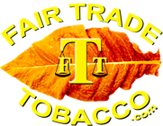
I also like the FTT Leaf on this sight. Just Change the words.
 

DGBAMA

Well-Known Member
Joined
Feb 10, 2013
Messages
4,418
Points
63
Location
NORTH ALABAMA
I think it is fine the way it is. Why confuse people that know the site already.
I also like the FTT Leaf on this sight. Just Change the words.

I like that Idea BT. The FTT logo is already very visually appealing; a variation on this already good and recognizable logo for the WLT site could be quite beneficial to the WLT business. We have a lot of viewers/visitors on this site, that may immediately identify WLT as a perspective supplier for their first purchase when looking for whole leaf, just because the logo would visually tie the two sites together and inspire consumer confidence.
 

DGBAMA

Well-Known Member
Joined
Feb 10, 2013
Messages
4,418
Points
63
Location
NORTH ALABAMA
That has much more potential. A bit monotone, maybe the print in a brighter/lighter shade. Afraid I am not good with graphics.

edit: the second one is much better, you guys are too fast for me.

wlt.jpg
 

winston-smoker

Well-Known Member
Joined
Oct 30, 2013
Messages
516
Points
0
Location
NYC metropolitan area
That has much more potential. A bit monotone, maybe the print in a brighter/lighter shade. Afraid I am not good with graphics.

edit: the second one is much better, you guys are too fast for me.

View attachment 9172

I like this one, but with the color of Don's second post. What I would change is the disproportionate size of the WLT letters ... the oversized W stands out too much, IMO. Its position in the middle might also be misleading, too.
 

DGBAMA

Well-Known Member
Joined
Feb 10, 2013
Messages
4,418
Points
63
Location
NORTH ALABAMA
The large W just made you see the letters in order, even though they are not. (and a big L in the middle looked funny, I tried it).
 

winston-smoker

Well-Known Member
Joined
Oct 30, 2013
Messages
516
Points
0
Location
NYC metropolitan area
The large W just made you see the letters in order, even though they are not. (and a big L in the middle looked funny, I tried it).

Why not have the letters in order, equally sized?
Or do you think that one large and two smaller letters is more aesthetically pleasing?
 

DGBAMA

Well-Known Member
Joined
Feb 10, 2013
Messages
4,418
Points
63
Location
NORTH ALABAMA
Just ideas. A take on the great fTt logo, and a chance to build "brand recognition" between the two sites.
 

Woodsroad

Well-Known Member
Joined
Dec 29, 2013
Messages
50
Points
8
Don,

Go with the FTT logo. Just substitute "Whole Leaf" for "Fair Trade" and put the url in the middle. Keep the branding message consistent!
What you really need to do is consolidate the sales site and this forum. Just use one name. It's confusing as it is. And I'd suggest using your real name on this forum. That is part of your brand. It took me a while to realize that you were the same guy that I was emailing with at wholeleaftobacco.com!
 
Last edited by a moderator:
Status
Not open for further replies.
Top