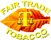
I do like the leaf. For the letters, I guess it would depend on the background.
To associate the two sites...
What about keeping it like it is (in the quote above) and add the "Scale" with W in the first balance, the big "T" in the center and "L" in the second balance (as you do with the FTT logo)?
And in both sites:
Store site - place the WLT Logo in the left top corner. And the FTT (forum) Logo in the right top corner (site linked).
Forum site - FTT like it is (top left). Then equally spaced to the right of, "
Dedicated to supporting Tobacco growers and consumers without intervention from Big tobacco or Big government." Put the store logo like it is as I quoted above (with scales W
TL - same letter style as the FTT logo).
I think that will tie them together smoothly.
I'm still very new here. I found the forum first through a search. Then from there your store site. Speaking honestly, I was very impressed. I don't know you that well, but it says alot when you allow others a way to not just learn to grow tobacco, but on a business level too. I see some people trying to get started and some who already are and promote themselves on a personal level. It's really neat seeing the relationships here. I haven't bought anything from anyone here, yet. I've wanted to. Believe me, your cigar leaf you have drives me nuts, lol. I do know that I will be getting some eventually.
For the "Whole Leaf Tobacco" logo, the color of the outside letters really depends on the background.
The "T" in the middle, after all it's about the Tobacco...